
An exhibition may invite us to explore, persuade us to buy, or set out to tell us a story. But whatever its purpose, the way it guides visitors through its space deserves as much thought as the works on display.
There is a long-standing debate about how far the curator of an exhibition should direct the experience of its visitors. Should the curator determine what we see, in what order, and with what understanding? Or should visitors have the freedom to find their own route, draw their own links between works, and construct their own meaning?
The answer depends, at least in part, on what the exhibition sets out to achieve.
A commercial gallery may arrange its works to draw attention to those most likely to sell. Price, subject, prominence and visibility from the entrance may all influence where a work appears. Such choices are not neutral, but they make sense in terms of the gallery’s purpose.
An exhibition that seeks to tell a story presents a different challenge. Where that story follows a historical sequence, chronology offers an obvious structure. The curator may want visitors to understand how one movement emerged from another, how techniques changed, or how artists responded to the social and cultural conditions of their time.
There is also a strong case for a less directed approach. Some curators, like some teachers, believe that people learn more when they construct their own understanding rather than follow a prescribed account. They may arrange works to encourage comparison, surprise and personal interpretation. Visitors become active participants in making meaning rather than passive recipients of the curator’s knowledge.
These are legitimate choices. They reflect different views of art, learning and the relationship between the curator and the public.
But there is a distinction between giving visitors intellectual freedom and making it physically difficult for them to see an exhibition.
This distinction struck me during a recent visit to Light and Magic: The Birth of Art Photography at the Tate Modern.
The exhibition sets out to explore a particular period in photographic history. It has a story to tell, supported by historical photographs, explanatory panels and carefully selected examples. The subject is fascinating. Yet the way the material is arranged creates problems that have little to do with competing theories of curatorship and much more to do with basic principles of communication and crowd management.
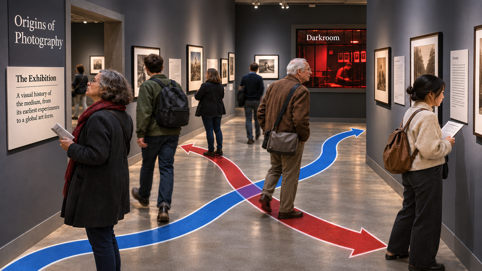
Consider the visitor’s arrival in one of the large exhibition rooms. An intriguing window into a darkroom attracts attention. It is an effective device, except that the darkroom belongs towards the end of the exhibition. It draws the eye towards something that the visitor will encounter much later.
The introductory panel describing the purpose and contents of the room appears on the wall behind the visitor. To read it, you must first realise that it is there and then turn around.
That might seem a small matter, but it raises a simple question about what happens next.
If the introductory panel is to the left of the entrance, the natural route is to continue around the room in an anti-clockwise direction. If it is to the right, as in the illustration here, the corresponding route is clockwise. Neither is inherently better. What matters is that visitors can grasp the intended direction without having to work it out.
Unfortunately, the exhibition alternates between these arrangements. Some rooms appear to encourage clockwise movement, others anti-clockwise movement. There is no consistent convention to help visitors find their way.
The same problem arises with the photographs themselves.
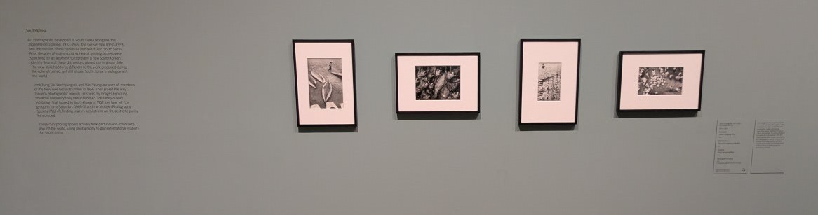
Works tend to appear in small groups, often three framed photographs accompanied by a descriptive panel. Some descriptions provide a substantial account of the works and their context. Others give little more than the photographer’s name, the date and the title.
Where a description forms part of the intended interpretation, there is a good case for placing it before the photographs in the direction of travel. Visitors can read the context and then examine the images, checking what they have learnt against what they see.
Of course, there are sound educational reasons for reversing this sequence. A curator might want visitors to encounter an image without prior explanation, make their own observations, and then read the text. That can be a powerful way to encourage close looking.
The problem is not whether text should come before or after an image. It is that the exhibition seems unable to decide.
Descriptions appear sometimes to the left of the photographs and sometimes to the right. In the case above, visitors see the images, then read a panel, turning back to examine something it mentions, only to find themselves crossing the path of someone moving in the opposite direction.
The result is a series of small but needless conflicts.
I visited at a fairly quiet time, yet on perhaps a dozen occasions someone crossed directly in front of me to check an image against its description, or moved around the room in the opposite direction. In a busy exhibition, such movements would create far greater disruption.
This matters because the visitor’s attention is a limited resource. When people must devote part of that attention to working out where to go, where to stand, or how to avoid obstructing someone else, they have less of it to devote to the photographs.
The issue is not simply one of convenience. It affects the quality of the experience.
Curators often have a great deal to say about the intellectual content of their exhibitions. They may explain their choices through ideas drawn from art history, cultural studies, critical theory or education. Yet the physical design of an exhibition also embodies a view of the visitor. It can respect the visitor’s time, attention and capacity to learn, or it can make unnecessary demands on all three.
There is an important difference between productive uncertainty and needless confusion. A challenging photograph may make us question what we see. An unfamiliar historical account may unsettle our assumptions. An unexpected arrangement of works may reveal links that a conventional sequence would conceal.
These are good reasons to challenge the visitor.
But having to search for an introductory panel, guess which way to walk, or step around other visitors who are following a different route offers no comparable intellectual benefit.
Nor does a coherent route have to mean a rigid one. Visitors can remain free to move, pause, return and explore while the exhibition provides a clear and consistent structure for those who want to follow it.
Perhaps exhibition designers could learn something from good teaching. A thoughtful teacher provides structure without dictating every thought, introduces context without closing down interpretation, and removes needless obstacles to learning. The aim is not to control what students think, but to create conditions in which they can think more deeply.
The same principle applies to curatorship.
I don’t want a curator to tell me what to think about a photograph. I welcome the chance to reach my own view, to question the historical account, and to discover meanings that the curator may not have intended.
But I would prefer not to spend part of my visit working out which direction I am supposed to walk.
Intellectual freedom is one thing. Poor crowd management is quite another.
Leave a Reply
You must be logged in to post a comment.